
EasyTask
MVP
Mobile responsive web
End-to-end design
Providing people in the process of moving access to logistic assistance
Moving can be stressful- especially when you are busy, moving for the first time, or not sure what you’re doing. So often moving becomes an overwhelming process of shoving things in boxes in the days leading up to a big move. EasyTask is an automatically generated task creation and organization product saving users needless time and energy in preparation so they can simply check off daily tasks and be prepared on moving day.
Role
Research, Ideation, Interaction Design, Product Testing
Timeframe
12 weeks
Project Type
Mobile responsive web design, MVP product, Service Marketplace prompt provided by UX academy
Initial Problem Discovery
What is the problem?
People need reliable moving resources all in one place. There isn’t a product that will meet you where you are and take you where you are going.
Moving is stressful! Many people struggle to find the time to think through every necessary step, organize those items, and implement them. Some users default to google searches for lists, services, and resources that may or may not include information relevant to them. While others just put it off until the last minute and ultimately end up cramming and aren’t even aware that they may be missing important things or completing their move inefficiently. The whole process can be overwhelming and time consuming.
Why is this important?
I aim to make this process simpler and more manageable for all people in the process of moving, to alleviate the stress and mental load that comes along with such a large transition.
Research Methods
01- Competitive Analysis
I conducted an audit on 3 companies that included moving resources in their overall umbrella
niche.com, bestplaces.net, city-data.com
02- User Interviews
I interviewed 5 people that had moved at least once in the last 5 years, asking qualitative questions about their moving experiences, goals, frustrations, and how they went through the process of moving.
100% cited a need for moving resources ranging from generic to location specific
Most cited a general lack of quality information and resources
Some cited specific resource needs- checklists, schedules, and how-to guides
After collecting these insights I narrowed my focus to moving resources to best benefit the specific needs of the user.
Who is this for?
POV Statements
I'd like to explore ways to help young professionals feel more independent and confident while moving because relocating can be overwhelming without practice and helpful resources.
I'd like to explore ways to help individuals find tailored tips and resources while moving because this can help them feel more organized and confident.
User Personas


Design Goals
Key Problems areas- users struggle to find reliable resources, users are overwhelmed by doing it entirely on their own from scratch, users find it tiring to create their own resources and then execute them in a short period of time
Ideation
Hypothesis
aka so what?
If I make a digital product that automatically populates personalized check lists relevant to users, it will save them time, effort, and eliminate stress from an already stressful transition.
The Solution
-
Based on a simple quiz at account creation, tasks auto populate based on information such as time frame and user experience. Allowing users to sit back while the organization happens for them.
-
Straightforward tasks, with a simple user interface allowing users to complete daily tasks easily.
-
Straightforward edit/ add functionality to allow users to remove tasks that aren’t relevant to them, add additional tasks they need to complete, and modify completion dates of tasks.
User & Task Flows
After determining key services, I crafted user and task flows to address the identified problems, setting the foundation for the MVP structure and wireframe creation.
As I progressed, my designs were frequently iterated from the initial sketches/ mid-fi wireframes, in order to enhance the overall user experience.
Here is the rationale behind some of those design decisions
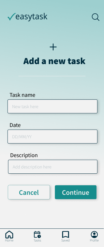
01: Homepage

initial mid-fi v1
Deleting has been added to each individual task to simplify usability
Borders are blended & lines are added to modernize design, and enhance scanning efficiency
Redesign of moving link to allow for a more intuitive appearance and function
Final hi-fi
Daily Tasks and Progress tracking simplified to be easier to navigate to their full pages
Buttons are colored & icons are added in order to promote visibility of features
Resources and community sections are added to homepage to be more easily accessible
Labels added to icons to increase accessibility for all users
Final hi-fi
02: Editing Daily Tasks

initial mid-fi v1


Brand Identity

Color Palette
Typography
Source Sans Pro is the font choice for EasyTask. It is easy to read and clear at all size and weight options. It is classic and professional while feeling friendly and simple.
Desktop
1440x1024
The logo should continue the clean, simplistic concept while representing the task management aspects. The check reminds users of the feeling of accomplishment when using the product and the experience of moving with ease.

The green evokes feelings of growth, prosperity, and optimism. The dark blue evokes feelings of dependability, security, and integrity. Combining these two colors with their complementary neutrals helped unconsciously encourage the same feelings we were looking for in the original brand identity and helps convey those feelings to the user.
Mobile
393x852

Icon Set
Simple, clean, and intuitive icons allow users to naturally function in the product.
I wanted the brand to convey a sense of intuitive simplicity and evoke feelings of positivity and optimism.
Brand Values: positive, useful, approachable, comfortable, simple, clear
Usability Testing
I tested the design’s impact through usability testing on 5 participants, focusing on 2 task flows.
-
The product was tested on the user’s ability to log in, answer quiz questions to generate the task list, and navigate to that task list
-
The product was tested on the user’s ability to navigate to their task list, and modify the individual tasks
The prototype testing revealed overall positive feedback with a 100% completing rate for both task flows. To further analyze their suggestions, I completed an affinity mapping exercise with the comments and suggestions from the participants.
From this information these were the prioritized iterations:
Navigation modifications- edit and label navigation features allowing additional navigation options and making the navigation menu more intuitive and accessible for users
Final Designs
Log In/ Questionnaire Pages


Homepage, Daily Tasks, and Edits


Interactive prototype
Closing Thoughts
What are solutions I think I completed in this project?
Tailored solutions-Flexibility for a wide range of customized items for a diverse group of users
Quick & straightforward tasks- manageable items in a checklist format to make it quick and easy to complete tasks
Save time and effort- answer a set of questions to have a curated list immediately for the users to utilize so they can immediately focus on actionable items
If I had additional time, I would…
Complete further research- I would conduct another competitive analysis more relevant to the direction the project ended up taking
Have a wider range of participants- due to limited time and contacts for user interviews the range of participants was rather limited. I would like to have a broader pool of participants for a more comprehensive view
Looking back, what did I learn?
So many things. I learned the overall process of end-to-end design, the basics of Figma, and the importance of flexibility to find the real problem that users are facing. I realized that my project was naturally focusing on a problem I wasn’t anticipating after conducting user interviews. Allowing for flexibility I was able to better create a solution for the user’s existing problem.
What was my biggest challenge?
Working without a team was difficult. From synthesizing interview data, to brainstorming solutions, I think I would have been better off having a partner or a team to bounce ideas off of or come up with useful solutions in a creative way. I did manage to simplify and focus on key problems that could directly impact people’s needs, humans just generally work more creatively as a team.